 |
 |
 |
 |
 |
 |
#505469 - 04/15/22 02:53 AM
 Keyboards and beauty or What's wrong with the look
|

Member

Registered: 11/11/04
Posts: 714
Loc: Russia
|
Hello again; I started to wonder if everything is fine with the appearance of today's keyboards. A revelation: they are black and plastic. It's practical. Black looks cleaner even when it's dirty, although my silver PSR-3000 still looks quite alright; plastic is lightweight and strong... But did it go too far? On Korg's site I saw Vox Continental. 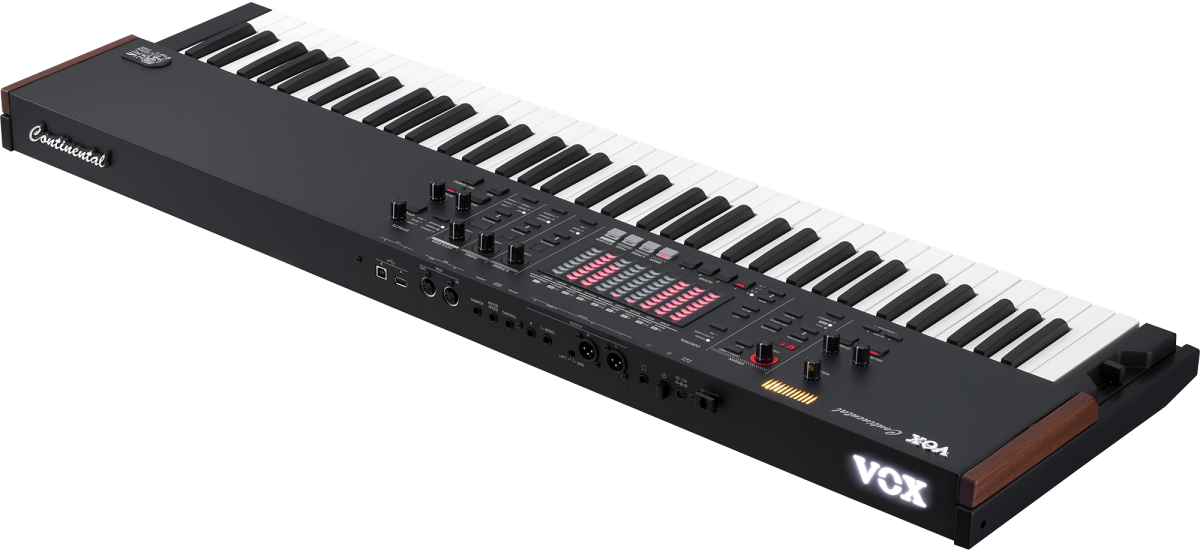 I actually liked it. It has "a leather texture black body accented with wooden side panels that add a vintage look." So does it have to be vintage to look cool? Yamaha Stage Piano CP5 also looks quite cool,  Again, it's a stage piano, and it's vintage. Perhaps, with the amount of buttons and a big screen as arranger has, there's not much room for a look. Nevertheless; I'm looking now at pictures of Roland Fantom, Fa, Yamaha Montage, and so on... I don't get it. It reminds me of VCR. VCR and its remote control. It's neither classy nor cool. An old Roland "PianoPlus" may sound silly now... But at least it looked warm!  I picture myself going to play my keyboard at some cafe or restaurant... Why does it have to look... just as a tool and nothing more? You look at guitars, there's such a variety when it comes to look, and everyone cares. And what about keyboard bags? All black! Okay, it's wise, it can be hard to clean and easy to get it dirty, but it's not impossible to make it washable. There are in fact pretty cool guitar bags: 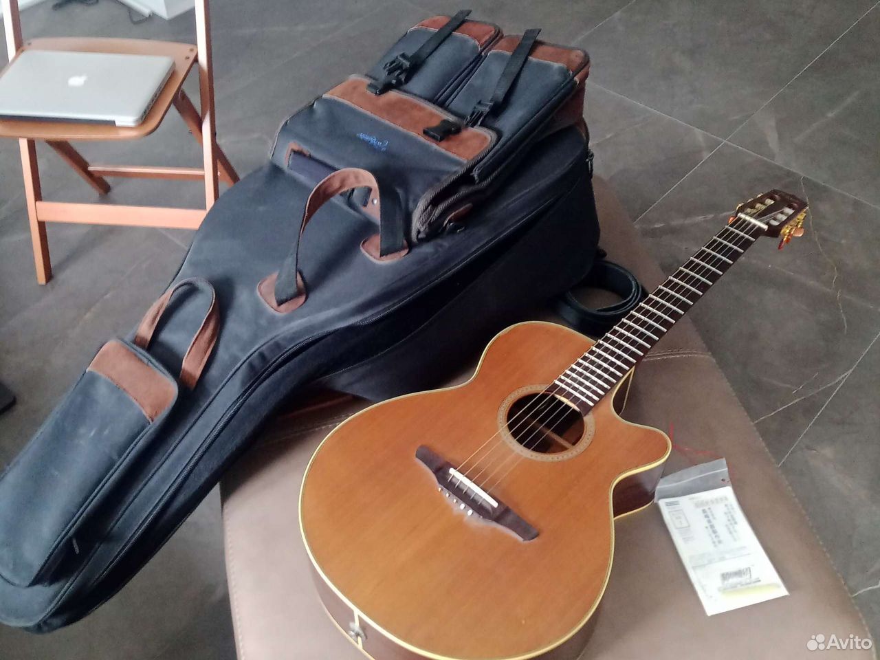 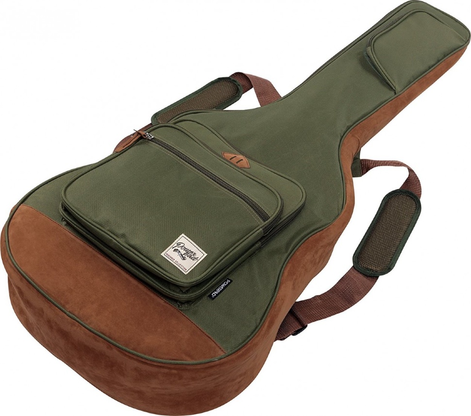 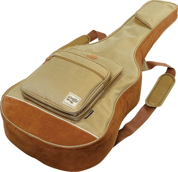 But generally it is like "oh, these keyboard players are such geeks, they are all about what's inside". To be fair, there are attempt to change it a little; for example, Korg Kross and Yamaha MX in variety of colors. I don't like that there's nothing in between 61 and 88 keys, but that's another issue. Nevertheless, so far I'd have to say that there's something uncool about most of the products in this field. What we call "contemporary" and "practical" can be just a "cost cutting solution", which implies that we basically don't care, or will buy it since we don't have a choice.
Edited by Kabinopus (04/15/22 02:56 AM)
|
|
Top
|
|
|
|
|
 |
 |
 |
 |
 |
 |
|
|
|
|
|
|
|
#505480 - 04/17/22 07:15 AM
Re: Keyboards and beauty or What's wrong with the look
[Re: Kabinopus]
|
Registered: 04/25/05
Posts: 14512
Loc: NW Florida
|
To the layman, a $700 piano and a $7000 piano look pretty much the same.
We as arranger players are faced with a dilemma… if you want a ‘button per function’ type arranger, it’s going to look like the flight deck of the Concorde, if you want a simple aesthetic, you’ve got to use pedals, footswitches and a bunch of registration programming to enable you to make complex changes on the fly.
And, to my mind, no one has yet designed a touch screen interface for an arranger that gets it right. Korg’s is too small, Yamaha’s is better, but then they wasted most of the screen real estate with huge pictures instead of a customizable display that puts the functions YOU want where you want them. Roland’s used to be decent but a bit small, and it still suffered from not being able to present a custom layout, so some things like the ending ritardando button were on pages that weren’t quick to get to.
But, all in all, I like the stripped down aesthetic more than the Concorde approach. And as for plastic black boxes thing, my back appreciates them! And I think I would rather the audience concentrated on me, not what I’m playing… And, let’s face it, unless in a theater tyle venue, the audience’s sight line doesn’t usually encompass the playing surface. So what they think of it ain’t my concern!
Big touch screens are the way forward, but designers got to stop making them pretty, and let a REAL arranger player design the layout, not a graphics designer!
_________________________
An arranger is just a tool. What matters is what you build with it..!
|
|
Top
|
|
|
|
|
|
|
|
|
|
|
|
|
|
|
|
|
|
#505521 - 04/20/22 10:52 AM
Re: Keyboards and beauty or What's wrong with the look
[Re: Kabinopus]
|
Senior Member

Registered: 12/08/02
Posts: 15595
Loc: Forest Hill, MD USA
|
The black color has been a tradition for decades, mainly at the behest of onstage players. They believed black appeared more professional, while other colors such as silver, gold, red, etc... gave the keyboard the appearance of a toy that someone would give to their grandchildren for Christmas. Fortunately, the plastic material that current arranger keyboards are constructed are high impact plastic, often stronger than steel and unlikely to undergo serious damage if inadvertently dropped on the floor. The main drawback with black is when performing outdoors in sunlight. It tends to get very hot, which could eventually lead to damage to some of the electronics. Silver, such as the PSR-3000, was a much better color for outdoor performers, as it did not absorb the sun's rays as readily. My S-950 got so hot that when playing in direct sunlight, you could not touch any of the keyboard's black surfaces because it would produce a nasty burn. All the best, Gary 
_________________________
PSR-S950, TC Helicon Harmony-M, Digitech VR, Samson Q7, Sennheiser E855, Custom Console, and lots of other silly stuff!
K+E=W (Knowledge Plus Experience = Wisdom.)
|
|
Top
|
|
|
|
|
|
|
|
|
|
|
|
|
|
|
|
|
|
#505544 - 04/22/22 11:05 AM
Re: Keyboards and beauty or What's wrong with the look
[Re: Kabinopus]
|
Member
Registered: 11/11/04
Posts: 714
Loc: Russia
|
Bruno, indeed, often it's our thoughts and feelings make us to see something as attractive or not; SX900 is surely a good company to have at home. Gary, interesting remarks; I never played anything outside yet, but I often think about it; it's true that outside is in fact a more aggressive environment than it is on a picture; even food tastes different in those conditions :-) Speaking about outdoors and design, I also want to point out that keyboards tend to be very "indoor" things; I wonder if we would ever see a waterproof model. Something like today's portable speakers, which young people (and older ones) carry along; but basically it is up to these young people, if playing keyboards was "a cool thing to do", certainly the manufacturers would response. But it's easier just to hit "play" on a smartphone and just to listen it as a background music... Nevertheless, I think Korg X50 was rather close to be "a street keyboard". But instead of seeing an improved version of a successful keyboard, we see "Korg Kross", which may be good as well, but it looks quite different.  It is hard indeed to keep the balance between making it "cool" and making it "a toy"... There's a popular TV series today called "Stranger Things"; it's popular today, but it shows 1980's America... (including the cold war with Russians...) ~ Well; there are good things today, there were good things in the past, perhaps sometimes we can go back and take there something valuable and use it with today's resources. It may seem "retro", but "retro" can be the good thing.
|
|
Top
|
|
|
|
|
|
|
|
|
|
|
|
|
|
|
|
|
|
#505547 - 04/23/22 02:10 PM
Re: Keyboards and beauty or What's wrong with the look
[Re: Kabinopus]
|
Registered: 04/25/05
Posts: 14512
Loc: NW Florida
|
Perhaps black was chosen as the color that shows marks the least on stage, and perhaps distracts the least from the player? I don’t think any color is any more or less ‘professional’ (okay, maybe pink is a bit cartoony!), red didn’t used to be a keyboard color much except for Vox organs until Nord adopted it, now it’s adorning pro stages everywhere.
Bottom line, a ‘professional’ color is whatever the hell professionals use. Make a brilliant sounding keyboard in pink, bet you pretty soon pink is considered ‘pro’!
Let me assure you, after decades of playing outside on Florida beaches and decks, it doesn’t matter what color the keyboard is. Half an hour in bright sunlight, and even a white keyboard will melt! And long before that, the display will overheat and cease to function. I pass on gigs that aren’t covered, no matter what color keyboard I use!
_________________________
An arranger is just a tool. What matters is what you build with it..!
|
|
Top
|
|
|
|
|
|
|
|
|
|
|
|
|


 Previous Topic
 Index
Index